Brandcraft
Help! My stakeholders are killing my conversion rates
Why broad consensus is costing you clicks
November 4, 2025
When we changed our name from Scéal to Moat, we needed a new logo. But we didn't want just a wordmark.

When we changed our name from Scéal to Moat, we needed a new logo. But we didn't want just a wordmark. We wanted something that captured what we actually believe about how brands work.
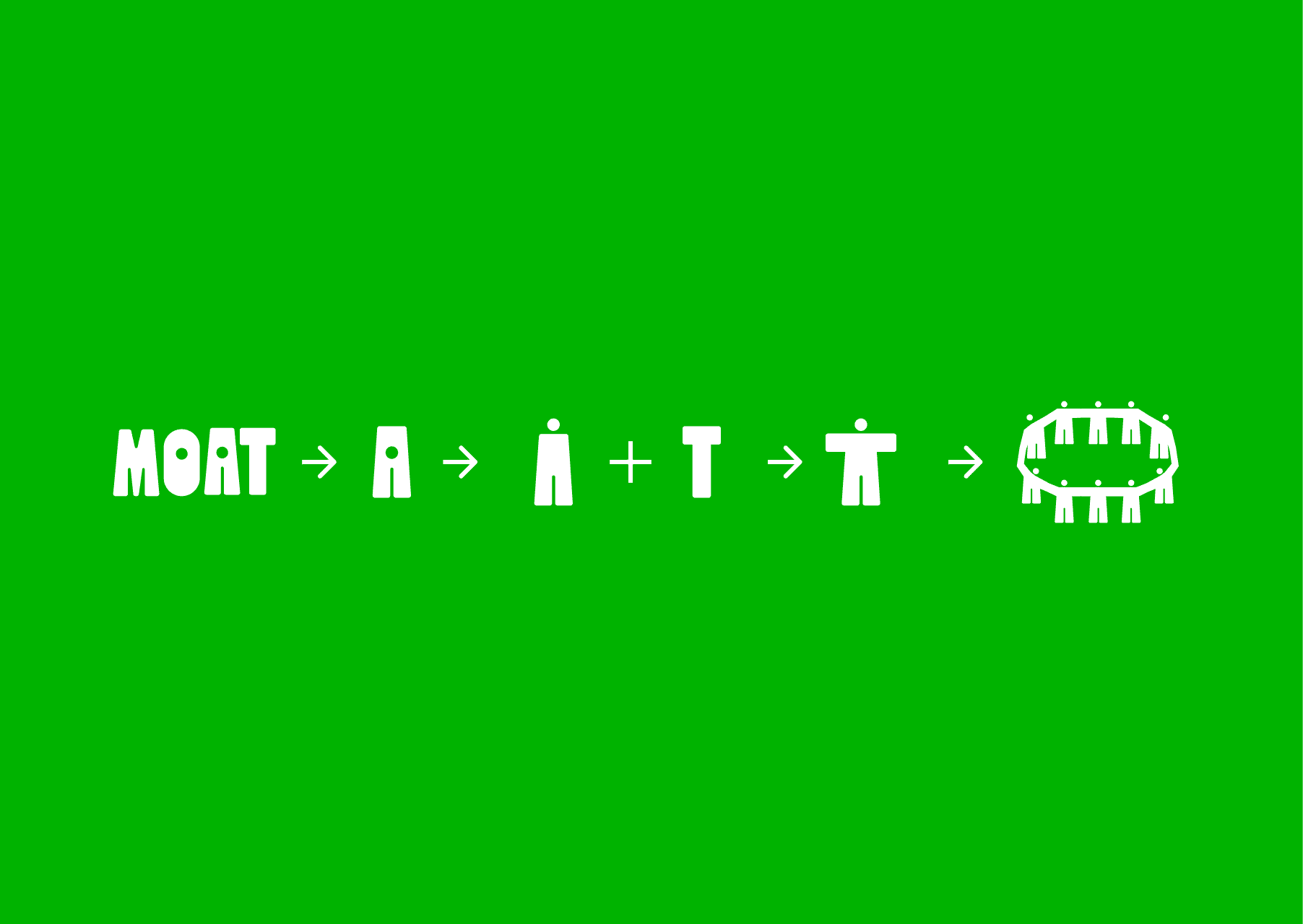
So we started with the letters, specifically A and T.
Early on, the A looked like a person. Not in a forced way, it just had that shape. Arms out, legs planted. The T was similar: a figure standing upright, reaching out.
When we put them next to each other, we realized they stopped reading as letters and started reading as two people, side by side.
Now we're onto something.
That's when we started seeing the real potential in this direction. In a world where everything feels algorithmic and optimized, where brands are increasingly built by AI and targeted by AI, we wanted something that felt unmistakably human. Not human as a style choice, but human as a fundamental principle.
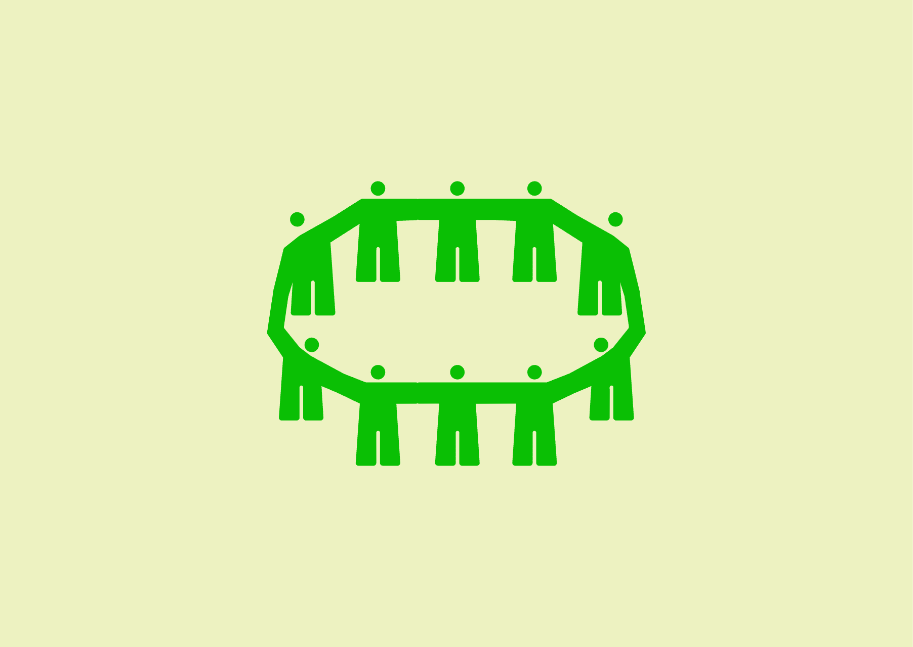
So we kept going - added more of them - and they formed a circle. A group holding hands. A structure that speaks to protection and connection.
And yes, it looks cool on a t-shirt. That’s important too.
In business, a "moat" means competitive advantage. The thing that keeps competitors from taking what you've built.
But the best moats aren't walls. They're communities. They're networks of people who believe in what you're doing and won't leave because they're connected - to you, to each other, to something bigger.
That's what our logo shows. Each figure supports the next. Together, they create something stronger than any individual part. Connection becomes defensibility.
Many logos are just marks. Ours is a system.
As letterforms, it spells our name. As a symbol, it's unmistakably human. As an idea, it scales - it can grow, shift, and adapt without losing what makes it work.
That's what we build for our clients. Not rigid brand systems that crack under pressure, but living structures that hold together because the people inside them want to be there.
At Moat, we don't build brands that just look good. We build brands that hold together.
Not through force. Through connection.
That's what the logo means.
